Introduction
Instructions
The section consists of different components:
(a) For graph: Join the highlighted points (with the same colour) and study the data.
When analysing a large amount of data, you may have come across various types of charts- a circle with different sections denoting data for different categories, rectangular bars aligned along the x and y-axis, having different heights to represent the change said to have occurred in a variable over a period of time. All these are graphs.
Say we have a phonebox(book containing the names, address and phonebook) having the names of all the registered residents in a given district. Say we want to know the average age-group the residents fall into? How daunting is the fact of going over pages and pages of info, instead of say: having that data collected and represented in a visual manner, to help in understanding the data better.

Graphs help us in visualising a large amount of data in a concise way
Graphs give a visual meaning to numerical values so that they are easier to understand and study
Since, we have already have seen some types of graphs, let's revise the basics a bit.
Line Graph
A line graph helps in highlighting how the data values have changed over a period of time. Below, we have an example of the temperature variation on a particular day(22nd Feb):
| Time | Temerature |
|---|---|
| 8 a.m | |
| 10 a.m | |
| 12 p.m | |
| 2 p.m |
Choosing a scale for the time and temperature variation, we can reperesent the data points given in the table on a graph. In other words, the graph is a visual representation of the data given earlier, in tabular form.
The horizontal line (usually called the x-axis) shows the timings at which the temperatures were recorded. The recorded temperature(s) are labelled on the vertical line (usually called the y-axis).
Now how to interpret this graph?
We can observe the pattern of temperature- the temperature is at the lowest during early morning and reaches its peak at noon. Notice that the temperature is increased by 8°C (= 32°C – 24°C) during the time period from 8 a.m. to 10 a.m.
While there is no measured temperature for say, a particular time like 9:24 a.m , however, we can view the graph and confirm that the temperature was atleast more than 25°C. Like this, for all points in between the start point and end point of the data set - we can estimate (if not accurately predict) the temperature for a said time.
Comparison Graph: Moving on to graphs which are useful in drawing comparison between two different data i.e. the Comparison graphs. These help in noting the similarities/ differences between the distinct data sets and are used heavily for data analysis between variables to note the pattern and relationship between them. Let's work with them now.
In the above graph, we have two line graphs combines together on a single scale for comparison- where the lines represent the total number of runs scored by two batsmen A and B, during each of the ten different matches in the year 2007. Based on the data presented, answer the following below questions:
(i) Which line shows the runs scored by batsman A?
(ii) Were the run scored by them same in any match in 2007? If so, in which match?
If Yes, which match?
(iii) Among the two batsmen, who is steadier?
Solution:
(i) Upon checking the data values in the table and verifying it with the data points on the given graph, we can deduce that the blue-coloured line graph belongs to the performance of batsman A.
(ii) We can see in the graph that for the 4th match , the line garphs for both the batsmen coincides. We can also see that they both individually scored 60 runs.
(iii) We can infer from the graph that-
(a) Batsman A: Has one great innings ("peak") but many unimpressive innings ("valley"). There is a lot of fluctuation in the performance level during the ten matches. Has scored zero runs as well.
(b) Batsman B: Has a highest score of 100 which is less than that of A (115) but never score below a total of 40 runs.
Therefore, batsman B is a more consistent and reliable player.
The below given graph describes the distances of a car from a city P at different times when it is travelling from City P to City Q, which are 350 km apart. Analyse the graph and answer the following questions:
(i) When did the car begin its journey?
(ii) How far did the car go in the first hour?
(iii) How far did the car go during - (i) the 2nd hour? (ii) the 3rd hour?
2nd hour:
3rd hour:
(iv) Was the speed same during the first three hours?
(v) Did the car stop for some duration at any place?
(vi) When did the car reach City Q?
Solution: From the graph, we can observe that:
(i) The car started the journey from City P at 8 a.m.
(ii) The car travelled 50 km during the first hour as we can see the journey started at 8:00 hours and at 9:00 hours (1 hour later), the car is at a distance of 50 km from city P.
(iii) The distance covered by the car during:
(a) the 2nd hour (from 9 am to 10 am) is 150 km – 50 km = 100 km
(b) the 3rd hour (from 10 am to 11 am) is 200 km – 150 km = 50 km
(iv) From the previous answers, we can observe that the speed wasn't the same through out as the distance covered suring each hour was different.
(v) At 11:00 hours and 12:00 hours the distance between the car and city P remains the same. Thus, the car didn't travel during that entire hour.
(vi) The car reached City Q at 14: 00 hours i.e. 2 p.m. (12 hour format)
Let's try out more problems.
Let's Solve
Can there be a time-temperature graph as follows? (Yes/No)
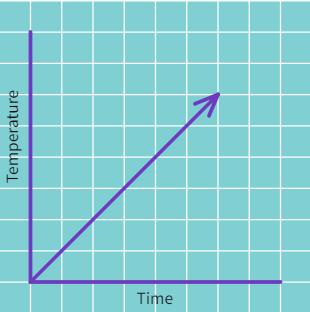
(a)
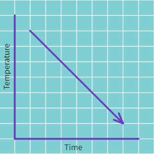
(b)
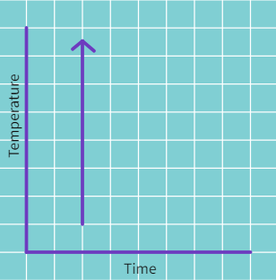
(c)
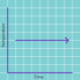
(d)
Solution:
(i) Yes, as it is showing the increase in temperature as time increases.
(ii) Yes, as it is showing the decrease in temperature as time increases.
(iii) No, as it is showing a very rapid instanteneous rise in temperature which isn't possible.
(iv) Yes, as it is showing a constant temperature being maintained at all recorded times.
Draw linear graphs for the following tables:
(a) The number of days a hill side city received snow in different years.
| Year | Days |
|---|---|
| 2003 | 8 |
| 2004 | 10 |
| 2005 | 5 |
| 2006 | 12 |
Join the coloured data points with straight lines.
Let's try another such problem.
(b) Population (in thousands) of men and women in a village in different years.
| Year | Number of Men | Number of Women |
|---|---|---|
| 2003 | 12 | 11.3 |
| 2004 | 12.5 | 11.9 |
| 2005 | 13 | 13 |
| 2006 | 13.2 | 13.6 |
| 2007 | 13.5 | 12.8 |
Join the coloured data points having the same colour using straight lines.
Let's try to decipher another graph.
The following line graph shows the yearly sales figures for a manufacturing company:
(a) What were the sales in:
(i) 2002:
(ii) 2006:
(iii) 2003:
(iv) 2005:
(b) The difference in the sales of 2002 and 2006 is
(c) In which year was there the greatest difference between the sales as compared to its previous year?
Solution:
(a) From the above graph we can conclude that:
Sales in 2002 = 4 crores
Sales in 2006 = 8 crores
Sales in 2003 = 7 crores
Sales in 2005 = 10 crores
(b) From the graph we can see that:
Sales in 2002 = 4 crores and
Sales in 2006 = 8 crores
Therefore,
Difference of sales = 8 - 4 = Rs. 4 crores
(c) We can observe that the year 2005 has the greatest difference in sales compared to its previous year (2004) with the difference being Rs. 10 crores – Rs. 6 crores = Rs. 4 crores
For an experiment in Botany, two different plants, plant A and plant B were grown under similar laboratory conditions. Their heights were measured at the end of each week for 3 weeks. The results are shown by the following graph:
(a) How high was Plant A after
(i) 2 weeks:
(ii) 3 weeks:
(b) How high was Plant B after
(i) 2 weeks:
(ii) 3 weeks:
(c) How much did Plant A grow during the 3rd week?
(d) How much did Plant B grow from the end of the 2nd week to the end of the 3rd week?
(e) During which week did Plant A grow most?
(f) During which week did Plant B grow least?
(g) Were the two plants of the same height during any week shown here?
Solution:
(a) From the above graph we can conclude:
(i) Plant A is 7 cm long after 2 weeks.
(ii) Plant A is 9 cm long after 3 weeks.
(b)
(i) Plant B is 7 cm long after 2 weeks.
(ii) Plant B is 10 cm long after 3 weeks.
(c) Plant A grew by 2 cm during 3rd week as 9 cm (3rd week end) – 7 cm (2nd week end) = 2
(d) Plant B grew by 10 cm (3rd week end ) – 7 cm (2nd week end) = 3 cm
(e) Plant A grew the most during the second week (difference of 5 cm).
(f) Plant B grew the least during first week (only 1 cm height gain).
(g) We can see that at the end of the second week, plants A and B were of the same height, that is 7 cm.