Artistic and Aesthetic Considerations
In addition to the steps described in previous sections, there are also some other more artistic and aesthetic aspects one can consider when preparing visual presentations of data to make them more interesting and effective. First, when making a visual presentation of data such as a pictograph or bar graph, it is important to make it fit in the intended space; this can be controlled, for example, by choosing the scale appropriately, as we have seen earlier. It is also desirable to make the data presentation visually appealing and easy-to-understand, so that the intended audience appreciates the information being conveyed.
Let us consider an example. Here is a table naming the tallest mountain on each continent, along with the height of each mountain in meters.
| Continent | Asia | South America | North America | Africa | Europe | Antarctica | Australia |
|---|---|---|---|---|---|---|---|
| Tallest Mountain | Everest | Aconcagua | Denali | Kiliman-jaro | Elbrus | Vinson Massif | Koscuiszko |
| Height | 8848m | 6962m | 6194m | 5895m | 5642m | 4892m | 2228m |
How much taller is Mount Everest than Mount Koscuiszko? Are Mount Denali and Mount Kilimanjaro very different in height? This is not so easy to quickly discern from a large table of numbers.
As we have seen earlier, we can convert the table of numbers into a bar graph, as shown on the right. Here, each value is drawn as a horizontal box. These are longer or shorter depending on the number they represent. This makes it easier to compare the heights of all these mountains at a glance.
However, since the boxes represent heights, it is better and more visually appealing to rotate the picture, so that the boxes grow upward, vertically from the ground like mountains. A bar graph with vertical bars is also called a column graph. Columns are the pillars you find in a building that hold up the roof.
Below is a column graph for our table of tallest mountains. From this column graph, it becomes easier to compare and visualise the heights of the mountains.
In general, it is more intuitive, suggestive and visually appealing to represent heights, that are measured upwards from the ground, using bar graphs that have vertical bars or columns. Similarly, lengths that are parallel to the ground (for example, distances between location on Earth) are usually best represented using bar graphs with horizontal arcs.
1. If you wanted to visually represent the data of the heights of the tallest persons in each class in your school, would you use a graph with vertical bars or horizontal bars? Why?
Heights are vertical measurements in real life. Using
| Classes | Heights |
|---|---|
| Class 1 | 150 cm |
| Class 2 | 155 cm |
| Class 3 | 160 cm |
| Class 4 | 165 cm |
| Class 5 | 170 cm |
2. If you were making a table of the longest rivers on each continent and their lengths, would you prefer to use a bar graph with vertical bars or with horizontal bars? Why? Try finding out this information, and then make the corresponding table and bar graph! Which continents have the longest rivers?
| Continent | Longest River | Length (km) |
|---|---|---|
| Africa | Nile | 6,650 |
| South America | Amazon | 6,400 |
| Asia | Yangtze (Chang Jiang) | 6,300 |
| North America | Mississippi–Missouri | 6,275 |
| Australia | Murray–Darling | 3,672 |
A
When data visualisations such as bar graphs are further beautified with more extensive artistic and visual imagery, they are called information graphics or infographics for short.
The aim of infographics is to make use of attention-attracting and engaging visuals to communicate information even more clearly and quickly, in a visually pleasing way.
As an example of how infographics can be used to communicate data even more suggestively, let us go back to the table above listing the tallest mountain on each continent.
We drew a bar graph with vertical bars (columns) rather than horizontal bars, to be more indicative of mountains. But instead of rectangles, we could use triangles, which look a bit more like mountains. And, we can add a splash of colour as well.
Here is the result:
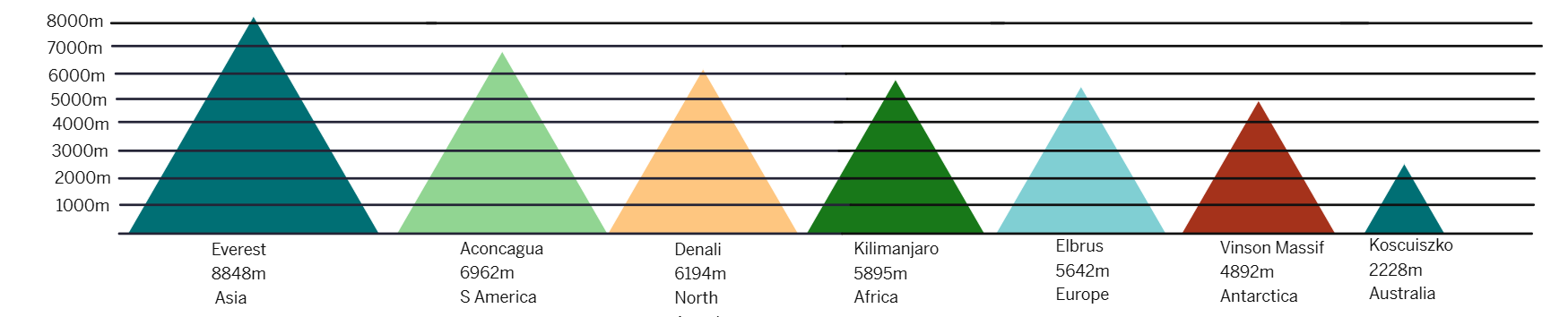
While this infographic might look more appealing and suggestive at first glance, it does have some issues:
- The goal of our bar graph earlier was to represent the heights of various mountains — using bars of the appropriate heights but the same widths.
- The purpose of using the same widths was to make it clear that we are only comparing heights.
- However, in this infographic, the taller triangles are also wider!
👉 Are taller mountains always wider? The infographic is implying additional information that may be Misleading and may or may not be correct.
Sometimes going for more appealing pictures can also accidentally mislead.
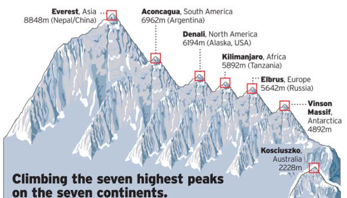
To make the picture even more visually stimulating and suggestive, we can further change the shapes of the mountains to make them look even more like mountains, and add other details, while attempting to preserve the heights.
For example, we can create an imaginary mountain range that contains all these mountains.
Is the infographic below better than the column graph with rectangular columns of equal width?
- The mountains look more realistic,
- But is the picture accurate?
For example, Everest appears to be
👉 What is {.m-green}5642 × 2?
While preparing visually-appealing presentations of data, we also need to be careful that the pictures we draw do not mislead us about the facts.
In general, it is important to be careful when making or reading infographics [pill:red], so that:
- we do not mislead our intended audiences, and
- we ourselves are not misled.