Pictographs
Pictographs are one visual and suggestive way to represent data without writing any numbers. Look at this picture — you may be familiar with it from previous classes.
| Modes of Travelling | Number of Students | 😊 = 1 student |
|---|---|---|
| Private car | 😊😊😊😊 | |
| Public bus | 😊😊😊😊😊 | |
| School bus | 😊😊😊😊😊😊😊😊😊😊😊 | |
| Cycle | 😊😊😊 | |
| Walking | 😊😊😊😊😊😊😊 |
This picture helps you understand at a glance the different modes of travel used by students. Based on this picture, answer the following questions:
- Which mode of travel is used by the most number of students?
Therefore, school bus is used as mode of travel by the most number of students.
- Which mode of travel is used by the least number of students?
Therefore, cycle is used as mode of travel by the least number of students.
A pictograph represents data through pictures of objects. It helps answer questions about data with just a quick glance.
In the above pictograph, one
Nand Kishor collected responses from the children of his middle school in Berasia regarding how often they slept at least 9 hours during the night. He prepared a pictograph from the data.
| Response | Number of children (▲ = 10 children) |
|---|---|
| Always | ▲ ▲ ▲ ▲ ▲ |
| Sometimes | ▲ ▲ ◢ |
| Never | ▲ ▲ ▲ ▲ |
Answer the following questions using the pictograph:
1. What is the number of children who always slept at least 9 hours at night?
Answer. In the table, there are
Therefore, 5 pictures indicate 5 × 10 =
2. How many children sometimes slept at least 9 hours at night?
Answer. There are 2 complete pictures (2 × 10 =
Therefore, the number of children who sleep at least 9 hours only sometimes is 20 + 5 =
3. How many children always slept less than 9 hours each night? Explain how you got your answer.
Answer. There are
Hence, 4 × 10 =
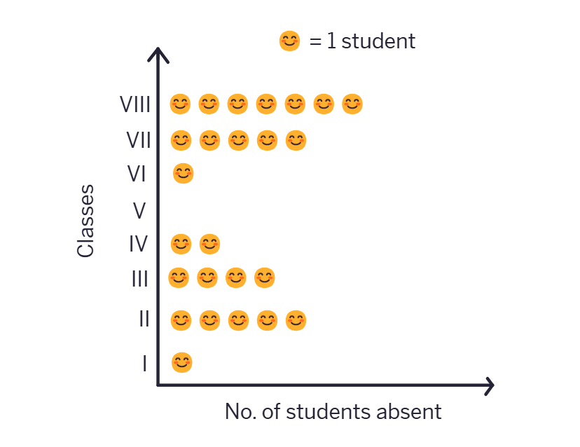
One day, Lakhanpal collected data on how many students were absent in each class:
| Class | 1 | 2 | 3 | 4 | 5 | 6 | 7 | 8 |
|---|---|---|---|---|---|---|---|---|
| No.of Students | 3 | 5 | 4 | 2 | 0 | 1 | 5 | 7 |
He created a pictograph to present this data and decided to show 1 student as in the pictograph —
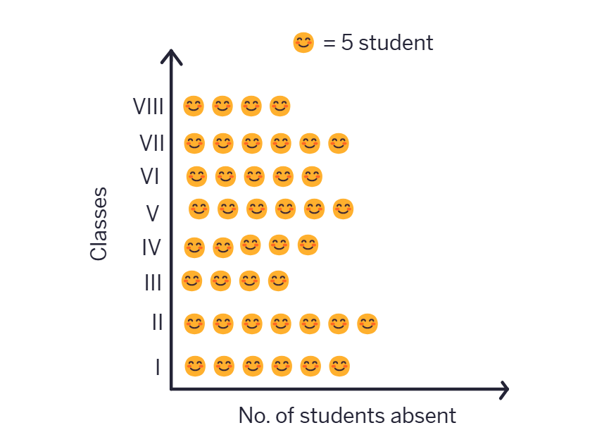
Meanwhile, his friends Jarina and Sangita collected data on how many students were present in each class:
| Class | 1 | 2 | 3 | 4 | 5 | 6 | 7 | 8 |
|---|---|---|---|---|---|---|---|---|
| No.of Students | 30 | 35 | 20 | 25 | 30 | 25 | 30 | 20 |
If they want to show their data through a pictograph, where they also use one symbol 😊 for each student, as Lakhanpal did, what are the challenges they might face?
Jarina made a plan to address this — since there were many students, she decided to use 😊 to represent 5 students. She figured that would save time and space too.
Sangita decided to use one 😊 to represent 10 students instead. Since she used one 😊 to show 10 students, she had a problem in showing 25 students and 35 students in the pictograph. Then, she realised she could use 🌗 to show 5 students
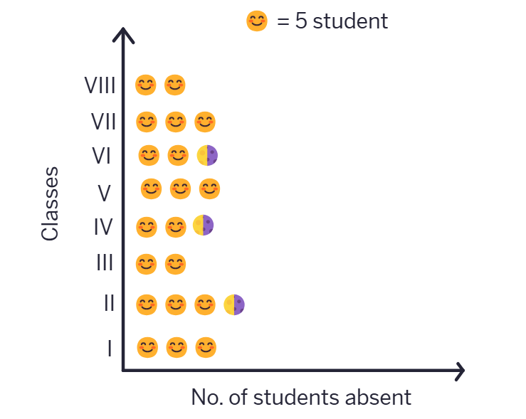
What could be the problems faced in preparing such a pictograph, if the total number of students present in a class is 33 or 27?
Pictographs for large data become challenging as they require many symbols, consuming space and making interpretation tedious. For irregular frequencies, such as 33 or 27, fractional symbols need to be used, which complicates understanding and reduces visual clarity. Additionally, maintaining uniformity and scaling in these cases is tricky. Using bar graphs or adjusting the scale to represent larger units (e.g., 1 symbol = 10 units) can simplify the process while retaining accuracy.
Pictographs are a nice visual and suggestive way to represent data. They represent data through
• Pictographs can help answer questions and make inferences about data with just a quick glance (in the examples above — about favourite games, favourite colours, most common modes of conveyance, number of students absent, etc.).
• By reading a pictograph, we can quickly understand the frequencies of the different categories (for example, cricket, hockey, etc.) and the comparisons of these frequencies.
• In a pictograph, the categories can be arranged horizontlly or vertically. For each category, simple pictures and symbols are then drawn in the designated columns or rows according to the frequency of that category.
• A scale or key (for example,😊 : 1 student or 😊: 5 students) is added to show what each symbol or picture represents. Each symbol or picture can represent one unit or multiple units.
• It can be more challenging to prepare a pictograph when the amount of data is large or when the frequencies are not exact multiples of the scale or key.
1. The following pictograph shows the number of books borrowed by students, in a week, from the library of Middle School, Ginnori.
| Day | Number of Books Borrowed (📖= 1 Book) |
|---|---|
| Monday | 📖📖📖📖📖 |
| Tuesday | 📖📖📖📖 |
| Wednesday | 📖📖 |
| Thursday | |
| Friday | 📖📖📖📖📖 |
| Saturday | 📖📖📖📖📖📖📖📖 |
a. On which day were the minimum number of books borrowed?
b. What was the total number of books borrowed during the week?
Total number of books borrowed =
c. On which day were the maximum number of books borrowed? What may be the possible reason?
2. Magan Bhai sells kites at Jamnagar. Six shopkeepers from nearby villages come to purchase kites from him. The number of kites he sold to these six shopkeepers are given below.
undefined
| Shopkeeper | Number of kited sold (🪁 = 100 Kite, 🎈 = | Pictographs |
|---|---|---|
| Chaman | 250 | |
| Rani | 300 | |
| Rukhsana | 100 | |
| Jasmeet | 450 | |
| Jetha Lal | 250 | |
| Poonam Ben | 700 |
Answer the following questions: